ILLUSTRATIVE ANIMATION
LEHMAN BROTHERS CORPORATE EVENT INVITES
Animations that are simple and fun are more impactful than a static email blast. The featured designs began with storyboards created in Illustrator and once approved, the graphics were appropriated in Flash/Animate to create movement.

LEHMAN BROTHERS > BONES & BONDS OFFSITE EVENT
Some transparent layers to signify water, a roll of an eyeball and the wiggle of a fishing lure. The thrill of the catch was the lure of this simple invite.

LEHMAN BROTHERS > ASTRO’s vs. cub’s BASEBALL EVENT
A simple change of perspective put this invite into play: a fly ball and some snacks… the fundamental elements of a day at the ball park.

LEHMAN BROTHERS > NEW HIRE MEET AND GREET EVENT
Good morning, newcomers. Time for coffee and donuts and a little elbow rubbing in the conference room. It’s the graphics and not the complexity of the animation that make these quick invites worthwhile.

ECOMMERCE WEBSITE DESIGN
IT’S NOT A ONE SIZE FITS ALL APPROACH. THE USER INTERFACE SHOULD BE DESIGNED TO BEST NAVIGATE THE PRODUCT OR SERVICE BEING PROMOTED.

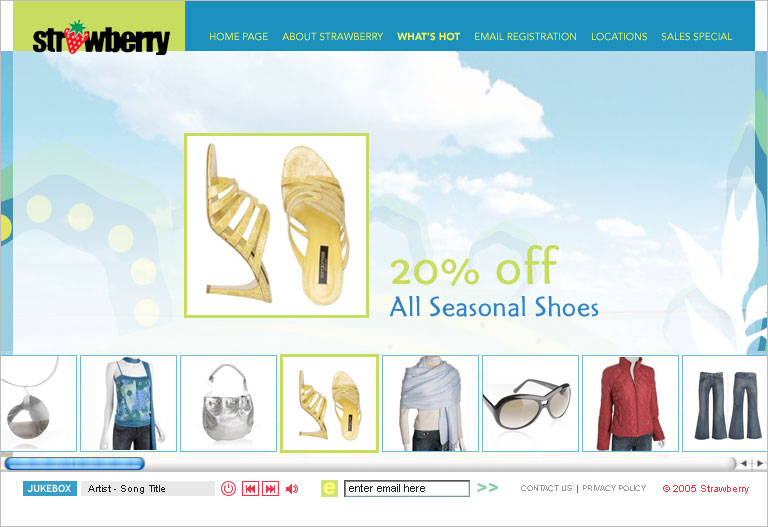
STRAWberry stores
“Inexpensive yet stylish” was the design aesthetic that was built to change with the seasons. The mission was to benefit the shopper, who gets the cyber experience of simultaneously choosing outfits and accessories collection by collection, while maximizing the store’s bottom line through the numerous items added to the shopping cart.


kate’s paperie
Practicality, function and frugality are what attracts the stationary shopper. The goals of this interactive design were a soft color palette, editorial style graphics, and an easy-to-navigate information architecture.


jan rich jewelry
High resolution photography and a surface navigation with a stationary landing page was the best approach for selling Jan Rich jewelry collections. They wanted customers to feel as if the jewelry was in front of them, like they could reach out and touch the pieces. The categories could be broken down by style or collection and you could choose to stay on the surface or scroll thumbnails within this clean, user-friendly site.


PROMOTIONAL WEBSITE DESIGN
USER INTERACTIVTY are of utmost importance
Whether it’s a place, product, or service the information needs to be presented in a way that communicates effectively.
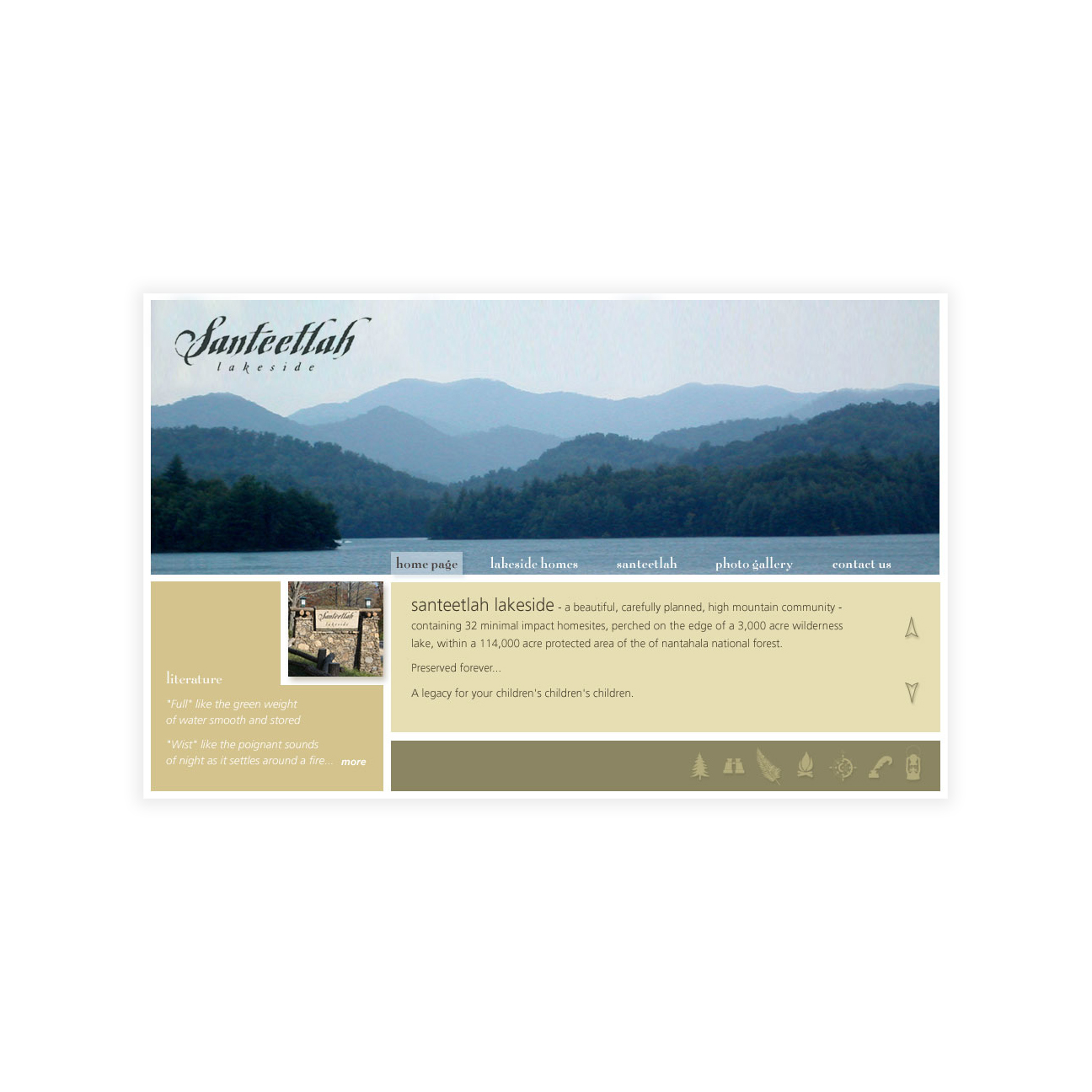
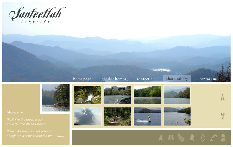
SANTEETLAH LAKESIDE
Two concepts were presented for this unique development of luxurious lakeside homes. The first design is clean and contemporary, highlighting the picturesque setting of the Smokey Mountains. The second concept utilizes photographic nostalgia as a user interface. Buying a home here offers timeless memories that your family will cherish for generations to come.


PRAVDA VODKA
This was a promotion site for Pravda that illustrated their “perfect 10” process for distilling premium vodka. The interactivity was dynamic and animated upon rollover. In the selection of each step, a window slides open to reveal a visual and a description for each stage of the distillation process.


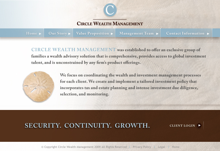
CIRCLE WEALTH MANAGEMENT
CWM was looking to set an appropriate tone for existing and prospective clients. When shopping for the right firm to handle your financial future, a sense of security in the company handling your assets goes a long way. Rest assured, you’re in the right hands with CWM! Two options incorporating a balance between natural and corporate elements were provided.

CORPORATE PRESENTATIONS
custom presentations deliver your messAge more Effectively

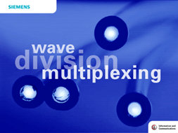
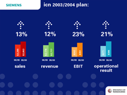
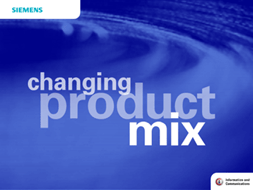
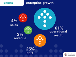
SIEMENS
The typical Powerpoint presentation wasn’t going to cut it for the CEO of Siemens, who was wrapping up an exciting speech revealing the innovative technologies they were rolling out. He needed a delicate blend of fresh, simplistic imagery to communicate complex information and make it easy to understand. Working to meet a tight deadline, this presentation hit the marks and generated several additional projects with similar companies in the industry.

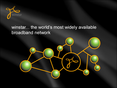
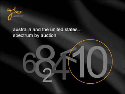
WINSTAR
The Winstar presentation was a challenge in that the content lacked the usual “hard facts”. Visuals were required to clearly express Winstar’s global network strategy, a dynamic and technical vision utilizing general broadband concepts. In keeping with their branding standards, unique symbols were developed to represent the various elements of the company’s network strategy. The symbols have impact and easily communicate the abstract concepts of broadband connectivity.


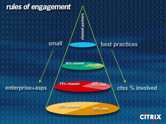
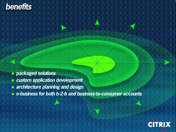
Citrix
The CEO from Citrix saw the Winstar presentation at a technology conference and wanted to deliver the same effective communication for their shareholders… in two days. They provided their intended PowerPoint presentation for a creative interpretation and re-design. Through the use of organic shapes, their corporate vision, technological abilities and goals were communicated in a way that made it much easier for shareholders to interpret.